 Back
Next
Digital (Krita)
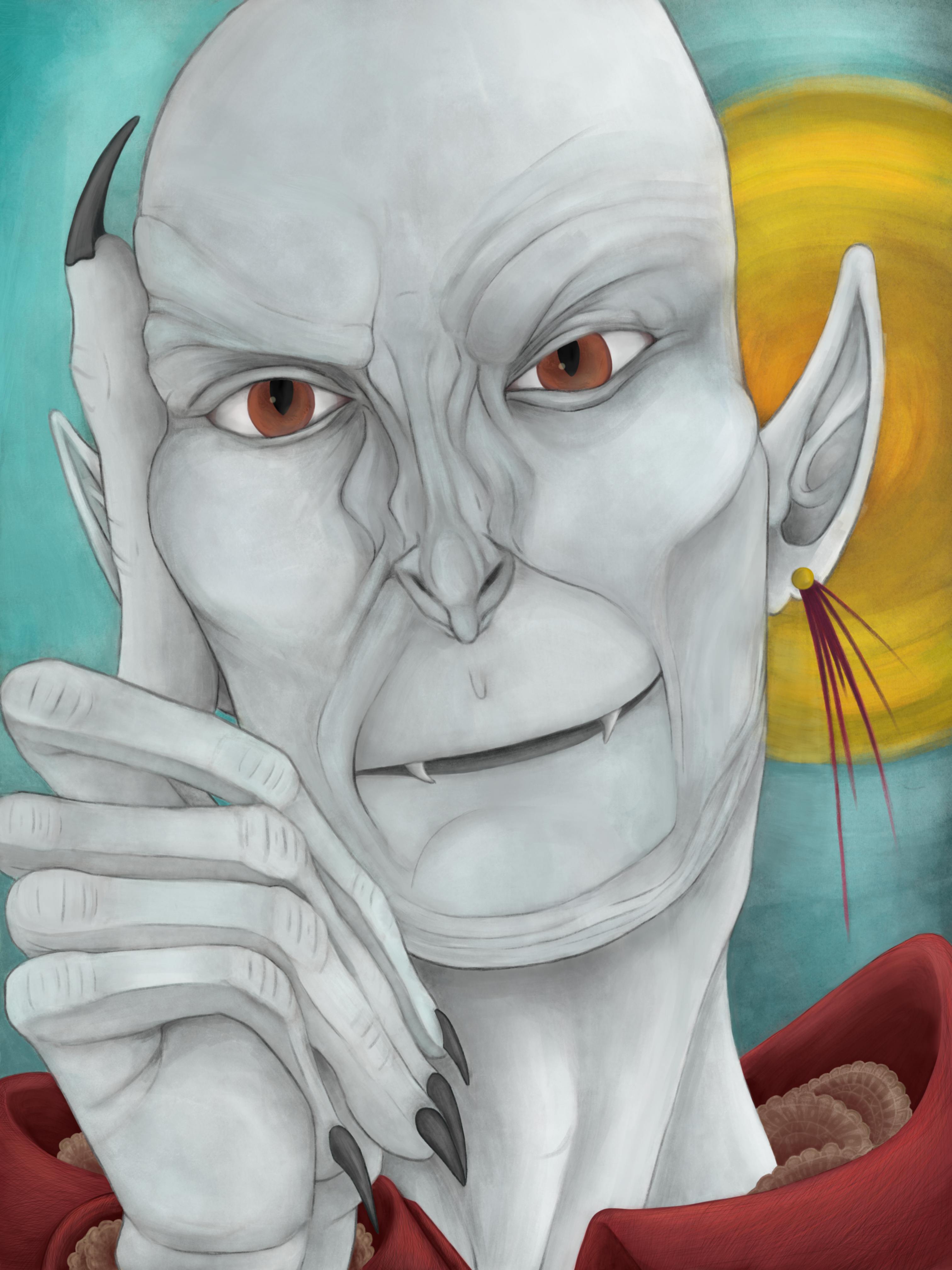
A fully colored edition of a sketch I made during down time at work. While I do like the colors, I really had to force myself to keep going here. There ended up being a bunch of mistakes, not the least of which is the accidental sixth finger floating somewhere adjacent to the rest of his anatomy. I just had to keep reminding myself that I'd be a lot more miserable if I abandond the work, which is what happens to most of the stuff I do.
Another peice made mostly using the default oil brushes on Krita, which have absolutely grown on me. In addition to producing a really nice effect, they also play nice with my seven? year old tablet. It still works, but the poor thing gets cantankerous when it comes to smooth, crisp lines.
Aside from kind of wanting to draw a face, it crossed my mind that most handsome or alluring vampires often leaned young in their depictions, so I decided to challenge myself and make a vampire who was seductive, but older, with a slight Nosferatu flair for pizzaz.
While I'm very fond of the way the blue and yellow background contrasts against his skintone, I am not terribly happy that the yellow orb reads so much like a sun. It is not a sun, or a light source, for that matter. I placed a circle there purely because I thought the space to the right of his head looked empty without it, and then colored it yellow because of how nicely it contrasts with blue.
That said, I doubt anyone on planet earth would look at that bright yellow sphere over there and say "Oh, that must be some visual fillar, an abstract shape that exists purely to balance the figures on the canvas."
Heck no, they would say "Hey man, that's a sun." and if they had any sense for art, they would probably also ask why the shadows are all cock-eyed compared to the light source, too.
Ah well, I promised I wouldn't be too hard on myself, and honestly, I think I did okay as a whole. The expression is solid, I think, and I do like how the area around the eyes turned out as a whole. And while I've obviously still got a ways to go regarding hands, there does seem to be some improvement.